Indesign Portfolio
Project two was a lot of fun because of all of the creative liberty we were able to
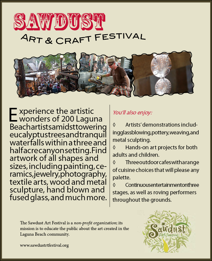
work with. One of my favorite things about the advertisement I ultimately came up with is the amount of
variety, mainly in the text. I used about seven or eight different text boxes to get the exact look and
feel I wanted. Text played a key role in this because it is an advertisement. My favorite text is the
one in which “Sawdust” is written at the top. Being in California, it gives it a western, yet “cool
enough for an art show” look. I was able to get the many different types of text by generating Paragraph
Types and changing features such as the leading and drop cap, which adds a nice touch to the main
paragraph. I took a screenshot of the website and used the eyedropper tool to create swatches of the
exact colors that are on the page. Every color on the advertisement is strait from the website,
this way, the physical advertisement, and the website both match. Another thing I like about the
advertisement are the pictures across the top, which I was able to get from the Sawdust site. I chose
these photos very specifically. The first one to show a broad view of the excitement and popularity of
the festival, the second to show an artist at work, and the third to show off one of many of the
beautiful pieces of art. I believe that this would make a fantastic advertisement for the festival,
and attract many participants!
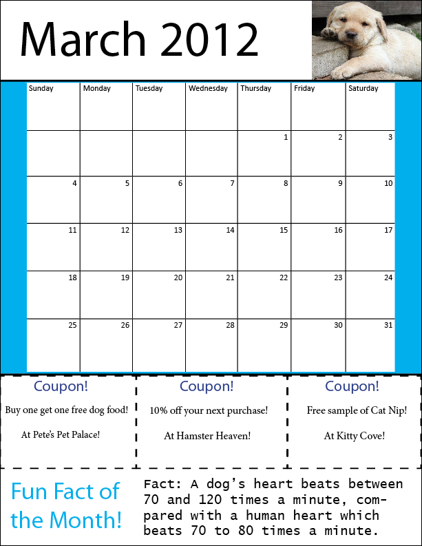
To start off for project three, I looked at a few different calendars that I had around the house. I had originally thought that a horizontal layout would be the best approach, but after looking at some real examples, I realized that a vertical spread was going to give me just what I wanted, for everything that needed to be incorporated. I took out a sheet of paper and pencil before even opening InDesign, and sketched out what I wanted my finished calendar to look like. This helped me have a clear goal in mind while doing the project.
I started off by generating the three months calendar in Microsoft Excel. This made thing a lot easier, because to get the calendar, I only needed to import the Excel files onto each page. I stared to edit the graphs/calendars to fit the page in the fashion that I liked, and I stumbled across a design feature that I changed to personalize my calendar. Usually, in the “day” row across the top of the calendar, that row is more condensed than the others. I made mine the same size as the others, so that whoever is using this calendar can write notes in the space provided!
Another thing I chose to do, which I feel adds a lot of character, is base each calendar’s color scheme around its animal picture. This was very simple using the Eyedropper Tool and Swatches Panel together. All I needed to do was import my picture, take a sample of the color I liked, and create a new color swatch. Then the border of my calendar could be created using the color.
One more small but prominent feature I added was the stroke around the Coupons being a dotted line. I feel that this is a great example of a real-world situation, because this shows the consumer that they can cut out the coupons with scissors and go use them!
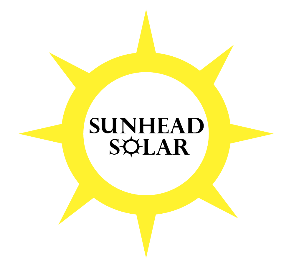
For this logo design, I decided to go as simple as possible. My first three or four
drafts of the design were good, but they had too much going on. Different lines going everywhere,
things crisscrossing, multiple colors, etc. However, I then took inspiration from one of my favorite
companies, Apple Computers. Apple does so well in their industry because they focus so much on having
their designs contain simplicity, whether it be a laptop, or their logo. Steve Jobs once said, “It
takes a lot of hard work, to make something simple.” So looking at the logo I had created, I decided
to simplify it… and it turned out great!
I knew I wanted to have the sun be a part of the logo just out of shear common sense of the consumer.
When you think of solar power, you automatically think of the sun. The center of the sun is actually two
spheres subtracted from each other using the “Pathfinder” tools, it originally had many things happening
behind it, but it was to distracting to the eye, and also wouldn’t have looked good sized down. I chose
to edit out the distracting elements and really get simplistic with it. Some of the most recognizable
brands today are also the most simple. I generated all of the points on the sun using the Pen and Convert
Direction Point tools. I also created the perfect color yellow for the sun by switching to a CMYK color
pallet; this gave me much more control over my design. Dropping “Power” from Sunhead Solar, and using a
smaller, text color matching version of the sun, inside of the sun, also brought simplicity to the design,
and is easy and fun for the viewer.